ABOUT
Work
Contact
ABOUT
Work
Contact
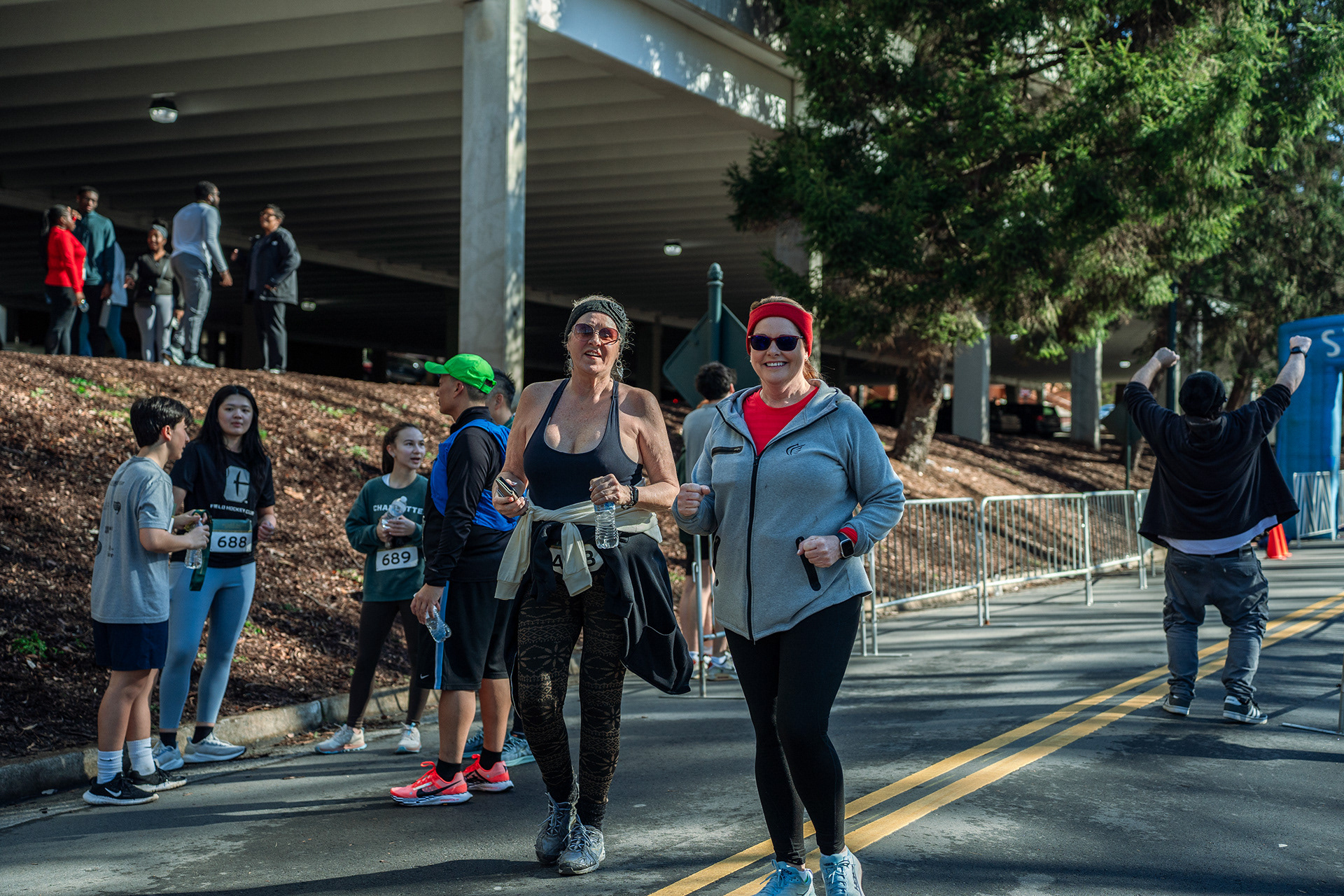
PHOTO ALBUM
SEE MORE
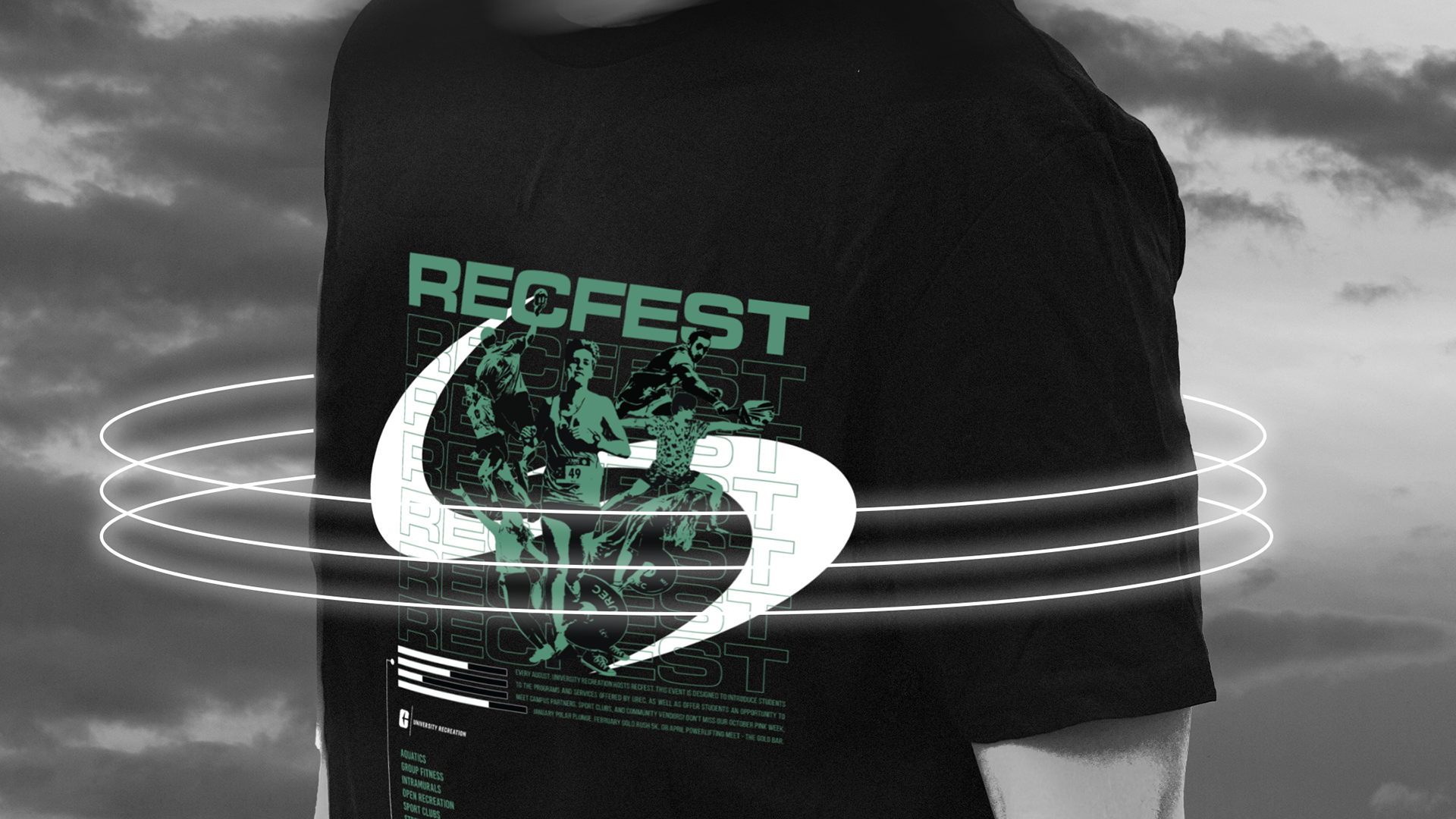
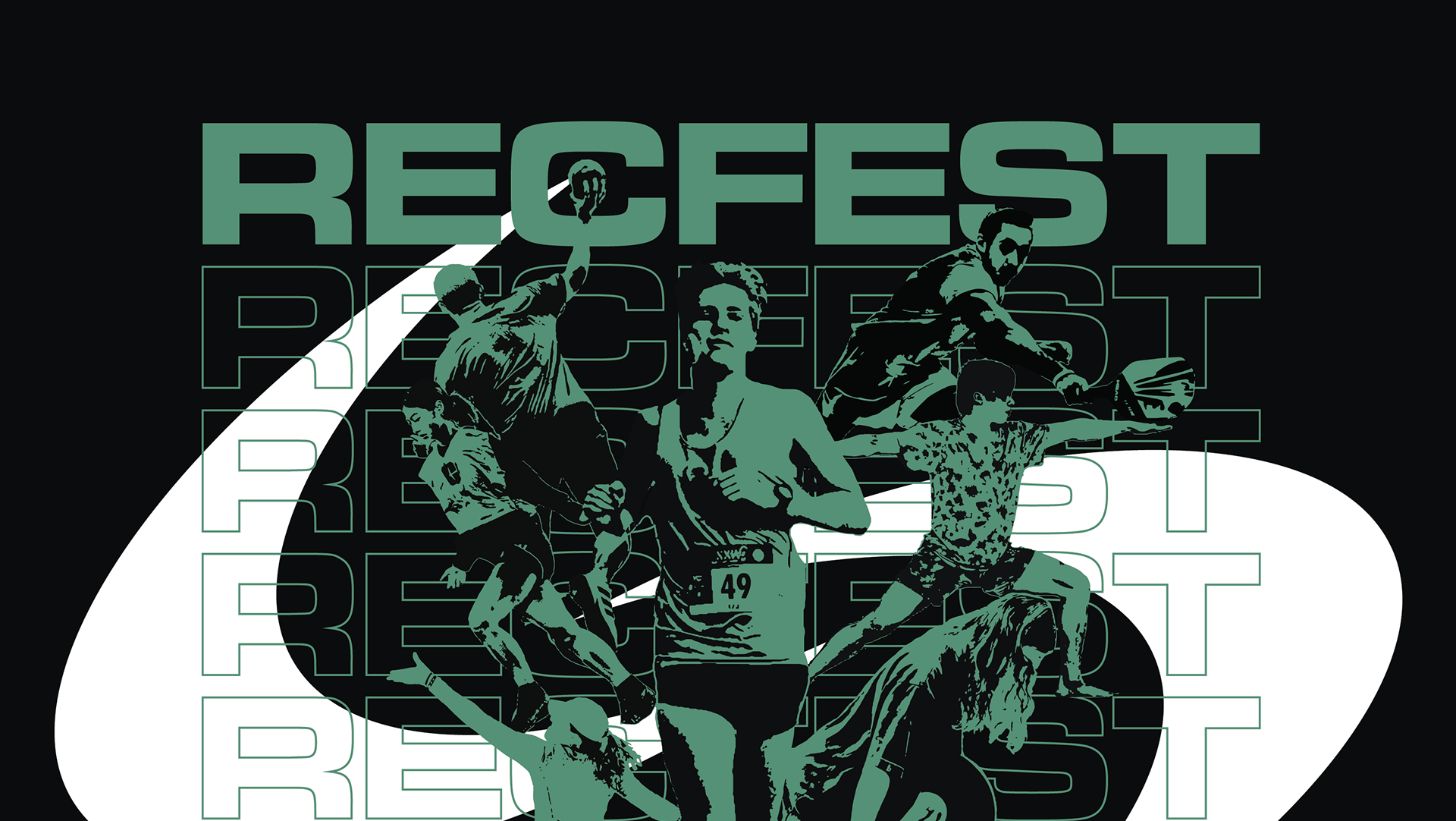
UREC - RecFest
2025
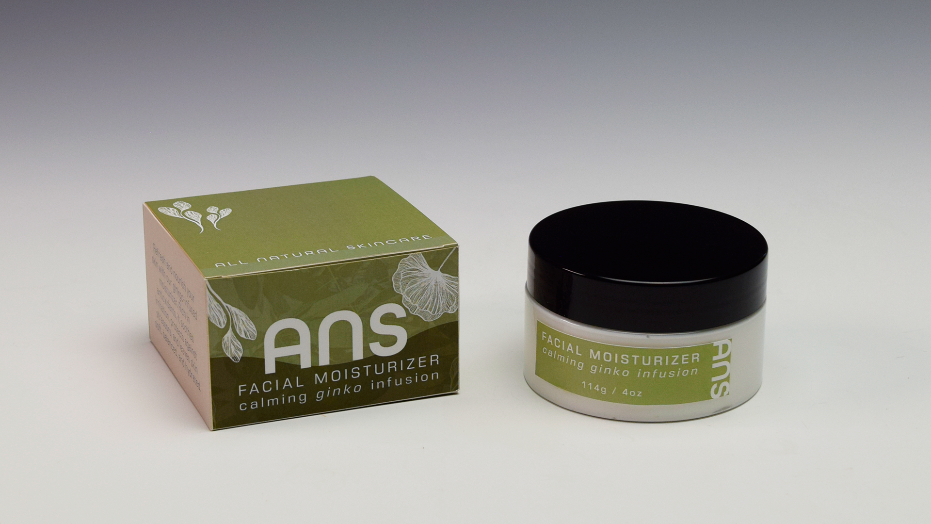
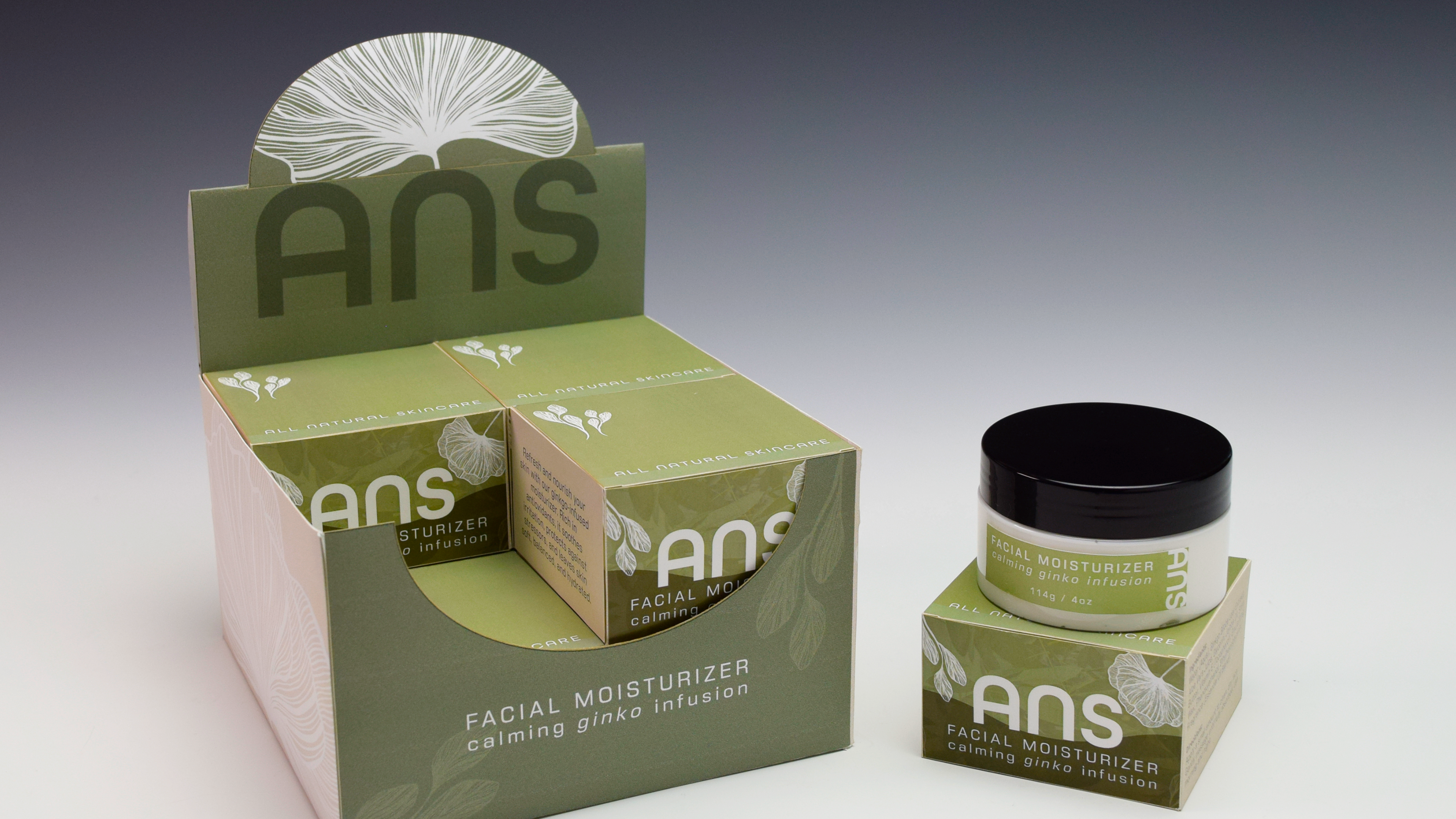
ANS Skincare
2025
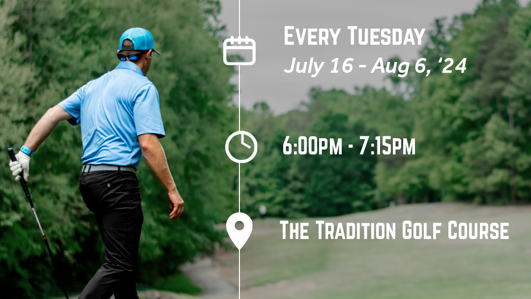
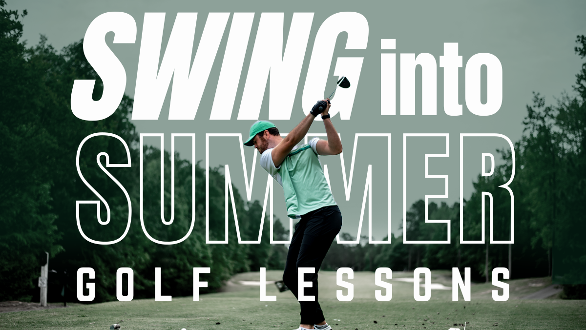
UREC - Swing Into Summer
2025
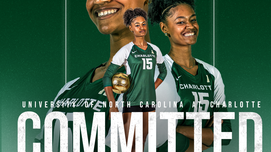
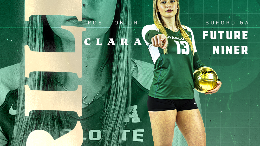
WOMEN'S CHARLOTTE VOLLEYBALL
2025
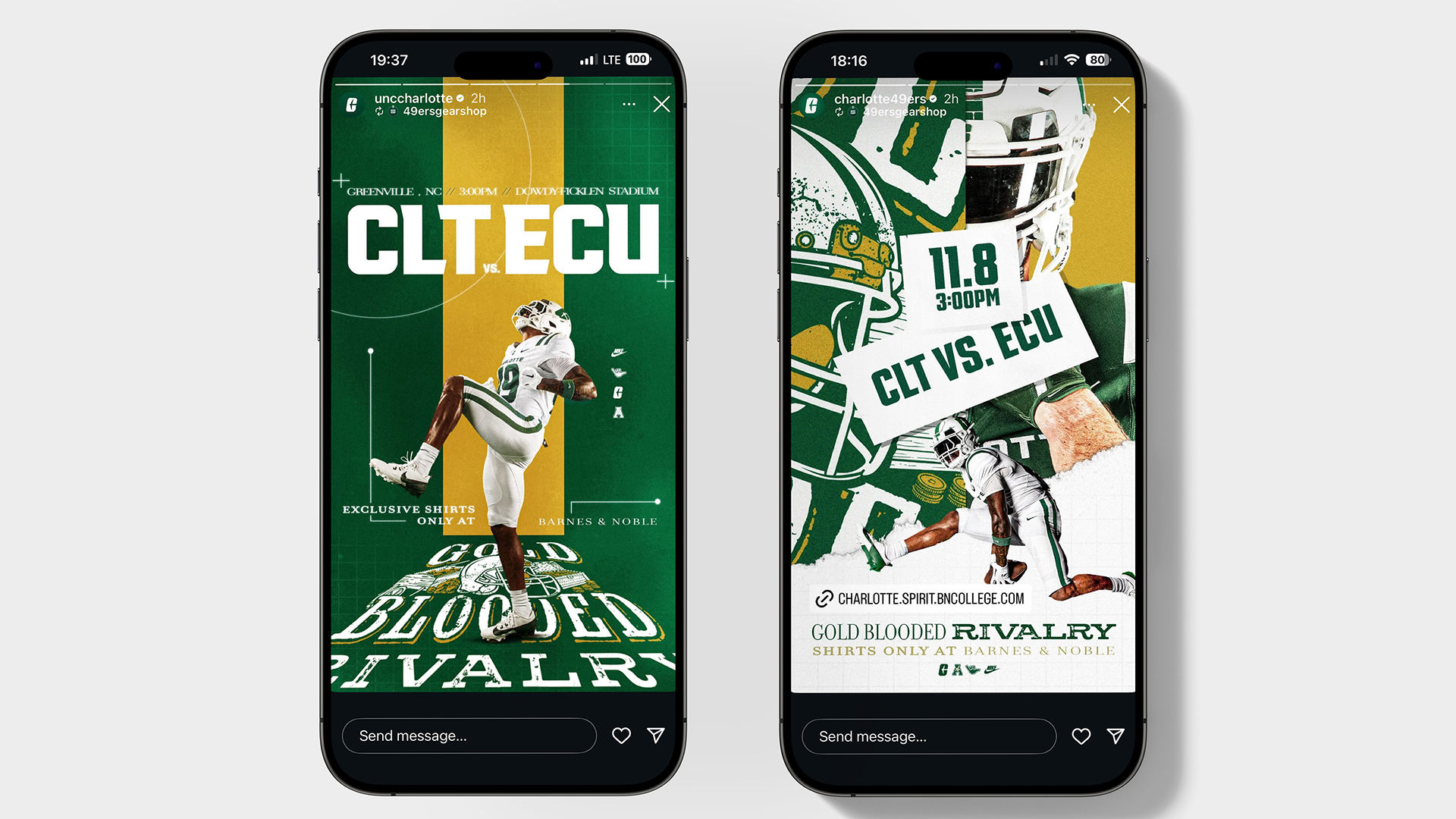
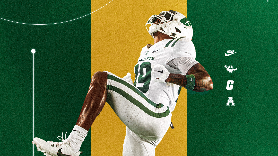
Gold Blooded Rivalry
2025
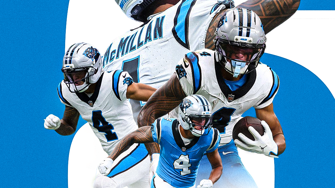
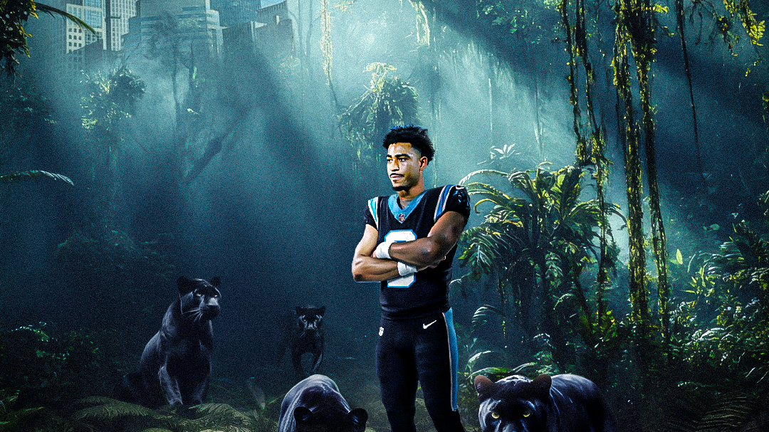
Sports Designs
2025
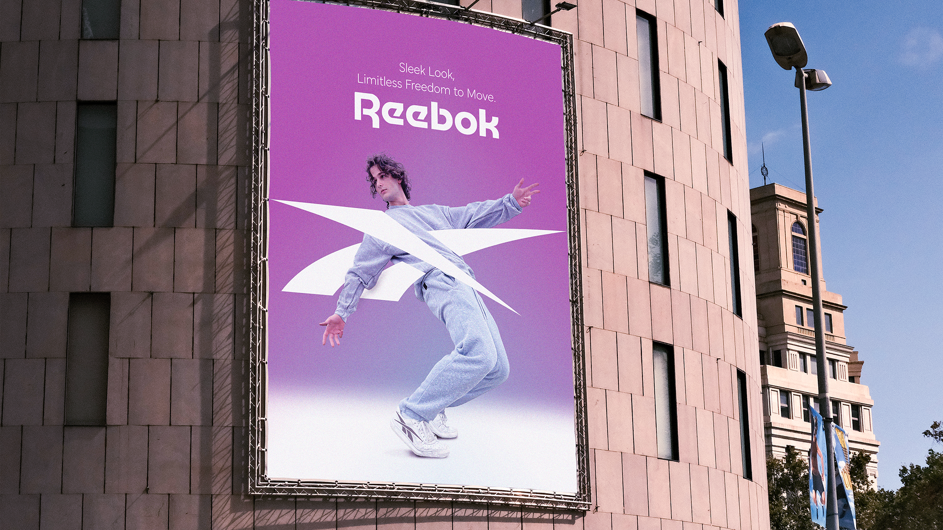
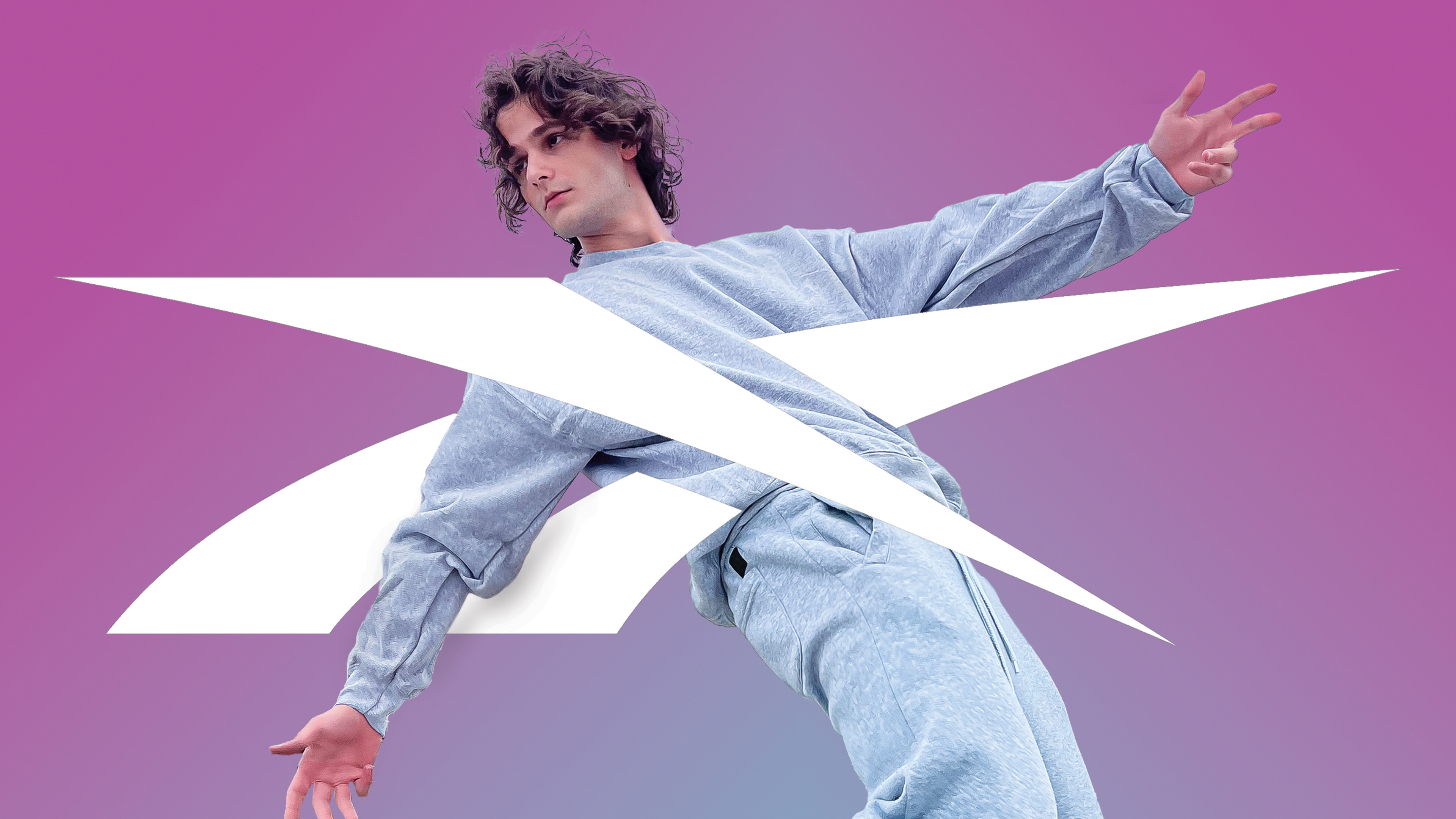
Reebok Ad Campaign
2025
↑
Back to Top